This being the blog of an artist, it seemed mandatory that the header utilize artwork by me, the artist. And since the header consists of the title of the blog, that meant doing some lettering.
I prefer hand lettering over computer lettering, just as I prefer original art done on paper or physical canvas over digital originals.
Here are the steps I took hand lettering the "Armstrong Comics" header.
1. I started with this thumbnail sketch:

The sketch is 4 inches wide by 1¼ inches tall. The guidelines were added afterwards, to facilitate doing subsequent drafts. Had I realized that I'd be giving an account of how I did this lettering, I would have scanned the initial thumbnail before adding guidelines.
The lettering is not based on any particular fonts or typefaces. I simply did the lettering that "felt right" for how it was to be used. I wanted the look of a logo that could appear on the cover of a comic book.
2. Next I did a tracing paper overlay. Here's the overlay on top of the initial thumbnail:

Here's the overlay by itself:

The only way I've found of doing tight, precise, highly detailed art is to do multiple drafts. Even if the art were on a single piece of paper or a single canvas, multiple drafts are done by using the eraser a lot, or by painting multiple layers.
3. Next I did an overlay of the first overlay, using copy paper (or printer paper):

Using a light box, it is possible to use copy paper like tracing paper. In fact, using a light box, it is possible to use 2-ply bristol board like tracing paper. 3-ply bristol board, though, is too thick for tracing even with a light box.
With each iteration, each tracing, I try to tighten the art. This particular iteration turned out to be a simple tracing, was a waste of time, and could have been skipped.
4. The next iteration though, done on tracing paper once more, yielded better results:

And here's that overlay by itself:

Besides putting a bit more effort into it this time, I wore an "OptiVISOR" binocular magnifier as I did the fourth draft.
5. Normally my next step would be to enlarge the thumbnail-sized art to original-art size using an Artograph--an opaque projector that throws the image onto paper on the table surface, where the art can be traced at the different size.
However, I don't have my Artograph set up at this time.
As a substitute for the Artograph, I scanned the fourth draft, opened the image in Photoshop, resized it using Photoshop, then printed it out at that larger size.
6. Then, using the light box, I traced the larger sized art onto 2-ply bristol board:

The art was now 10 inches wide by 2¾ inches tall.
If the lettering were for use on a comic book cover as a logo, I probably would have done it 17" wide--the maximum size for my scanner. But since it was to be just a header for a blog, 10" wide (the width of comic book non-bleed art interior art) seemed adequate. The reason for doing the original art as large as possible (when doing nondigital art) is that the artwork looks tighter and sharper the more it is reduced for printing.
7. I inked the "Armstrong" part using a No. 3 (.80) Rapidograph technical drafting pen filled with Rapidograph Black India Ultradraw ink (3085-F). The "comics" part I inked with a Hunt #22 Extra-Fine dip pen, dipped in FW acrylic ink.
The inking was done freehand. My feeling is that if part of a lettered title or logo is done freehand, it should all be done freehand. Doing part of it with inking aids--straight-edge, compass, french curve--would make the parts done freehand stick out like a sore thumb.

8. The copyright notice was lettered freehand on bristol board at a standard size for comic book interior art, using a technical drafting nib held vertical with a lettering joint to avoid skips in the ink lines:

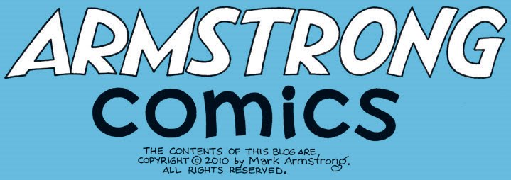
9. Then I started a new document in Photoshop, placed the logo and the copyright notice where I wanted them, and saved that file:

10. I did the coloring digitally using Photoshop:

If I were to redo this particular lettering sometime, I might import a scan of one of the pencil drafts into Adobe Illustrator as a semi-transparent layer and do the lettering as vector art in another layer over the pencil layer. Then I would remove the pencil layer.